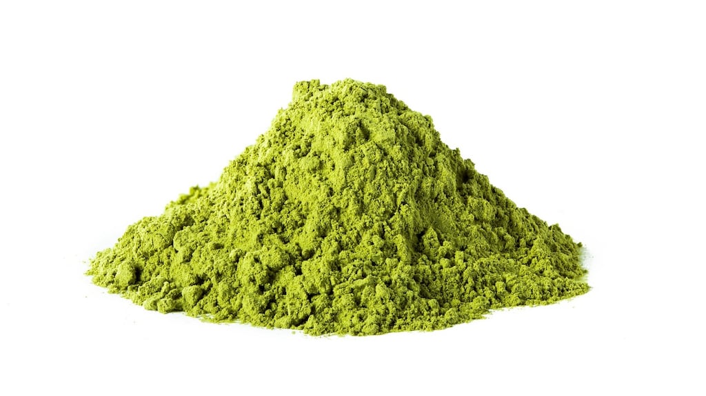
To describe a colour as "deadly" sounds like a jolly colloquialism – but in the early development of paint colours, a colour really could be kill you. Scheele's green, often described as an apple green or a light sea green, was one of the arsenical greens discovered at the end of the 18th century – the clue as to why it might cause injury to those who came in contact with it is in its poisonous origins. It is called after Carl Wilhelm Scheele, a brilliant Swedish chemist, who discovered the compound in 1775 – and its vivid hue and usefulness, especially when mixed with an oil base, made it popular. More experiments on the compound produced schweinfurt – or more commonly known as the more appealing sounding and close to our national heart, emerald green – again widely popular. We tend to think of Georgian interiors as being pale and calm when in fact they were a riot of colour. By the early 1830s the danger of arsenical green had been recognised all over Europe and by 1845 it has been banned in several countries – although William Morris was still using it for his wallpapers as late as the 1880s. For this information I am indebted to Patrick Baty's extraordinary – and beautiful – new book The Anatomy of Colour (Thames and Hudson).
A deadly shade of green with a touch of arsenic
Design Moment: Scheele green, 1775


