Swipe your phone, gaze at a 42in plasma screen, or just look at packaging for children's toys, or the interior of a McDonald's. We live and breathe a world delirious with colour. Black and white photographs are olde-worlde, connoting stasis and sobriety in tones of grey but Adobe Photoshop's alchemy comes to the rescue, showering them in technicolour. Colourisation, it seems, salvages photographs from the dustbin of history.
Retrographic is an anthology of colourised images, showcasing the work of professional colourisers as well as what the compiler, Michael Carroll, calls "skilled hobbyists". One of the professional colourisers in his collection is Marina Amaral and a book of her work, The Colour of Time, has also been recently published.
Professional colourisers, respecting the black and white photographs they curate and work on, are concerned to transform them without sacrificing historical accuracy. By interfering with the original they risk producing something ersatz; divesting black and white photographs of their intrinsic uniqueness. But colourists defend their practices with conviction.
Unlike the elimination of those images of Trotsky standing alongside Stalin and Lenin, colourists rightly point out that the original photograph always remains to be seen and appreciated. The vibrancy that colour brings is something of value for an Instagram generation distanced from past events; history seen in black and white risks becoming indelibly antiquated. Asking Marina Amaral about this elicits wholehearted agreement: "It definitely helps us to develop empathy and connect in a more intimate way with the subjects".
Albert Eisenstaedt's famous black and white photo of a sailor kissing a nurse in Times Square during the VJ Day celebrations on August 14th, 1945, might look irredeemably retro to young people, relegated to an ancient history they have difficulty relating to. The glamour and collective celebration of that moment was seen and felt when Life magazine put the photo on its front cover a week after it was taken. Nearly 75 years later, Amaral's version recreates the thrill for millennials. With colourisation, as she puts it, "we are instantly more open to hearing and understanding the stories behind the pictures".
Technology
Whether colourisation enhances the truth value of historical records that originally existed in black and white is another matter. Michael Carroll points out that press photographers in the past shot in black and white because of the technology available to them. Aesthetics, he claims, “is secondary to the historical record in journalism” and if they had a choice they would have shot in colour. “Colourisation allows us to bear witness to what the contemporary photographers would have seen with their own eyes when they captured the moment through the viewfinder”, adding that viewfinders never provided a black and white view.
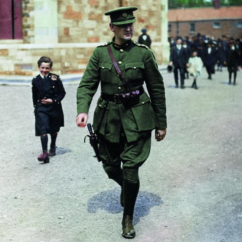
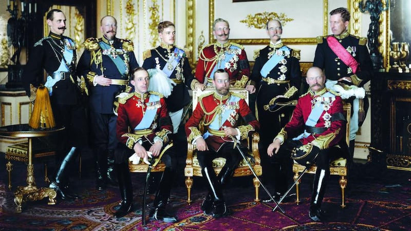
Crucial to the controversy is the issue of historical accuracy. For colourists like Amaral there are difficulties to be overcome. Particularly time-consuming was her work on the photograph of nine European kings – in Windsor for the burial of Edward VII in 1910 – who gathered in one room for a group shot. Her challenge was the number of medals and uniforms in the picture. “I had to identify them correctly to be able to use accurate colours.”
But however painstaking the research, there are always likely to be colours that cannot be authenticated. The dress of a woman enthralled by the sailor kissing a nurse on VJ Day is coloured in blue and white by Amaral but she acknowledges that this was “an artistic choice”. The problem is that the viewer has no way of knowing which colours have been accurately established: colourised pictures become, to some degree, fictional.
Carroll is sensitive to the issue. “Yes, I do agree this can be problematic,” he says. “However, as viewers I think we need to take some responsibility as to how we consume colourised material, questioning the reliability of our sources as we should with all history, as well as news and current affairs.”
Distinction
Perhaps a distinction needs to be made between black and white photographs of historic import, like the Times Square one, and those that possess an aesthetic value inseparable from their absence of colour. To colourise an image that is testimony to photography as an art form is, putting it bluntly, bad taste because it robs the original of its intrinsic value.
There is an analogy with cinema. Is colourising the work of great photographers who worked in black and white as aesthetically inept as colourising movie classics like Casablanca and High Noon?
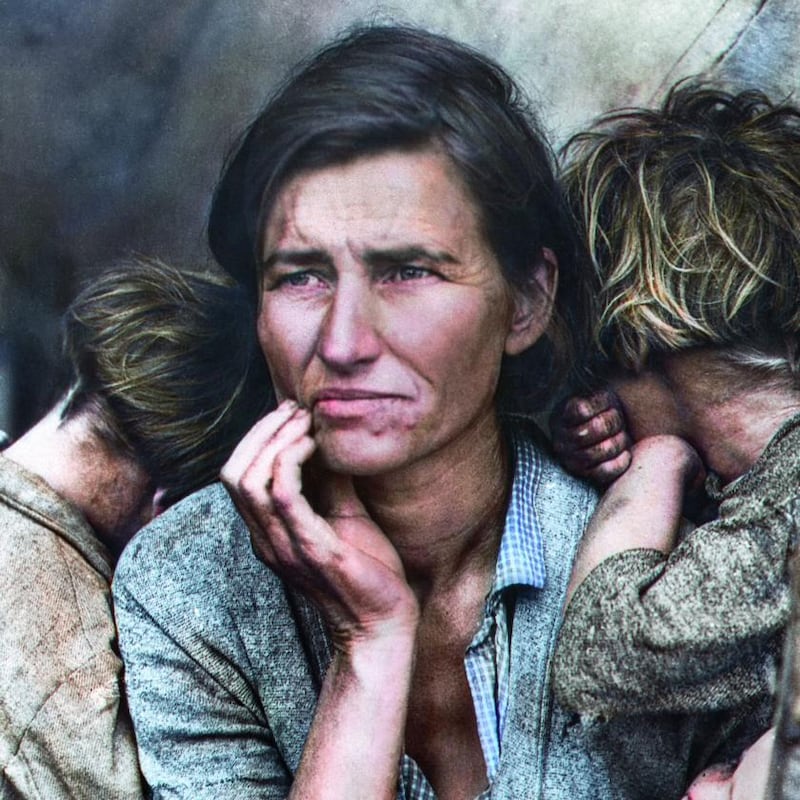
Two versions of Dorothea Lange's Migrant Mother by two different colourists appear in Retrographic and The Colour of Time. For Carroll, a famous photograph like this is bound up with the history of the mid-20th century. It is, he says, our knowledge of the adverse conditions of the woman in the picture that lends power to the image and he believes that colourisation, accurately performed, can only add to this history: "It is the history that makes the shot what it is, and allows us to emotionally connect with the subject."
Conversely, a sublime timelessness can be attributed to Migrant Mother, situating it within a tradition of Madonna and Child images that transcends its documentary identity. If its socioeconomic setting was unknown and the title removed, the photograph could be seen in other ways without diminishing its aesthetic and powerful form.
Berenice Abbott took some colour images in the 1950s but deprecated their value, saying colour "crowds the picture and affects the composition". This was her aesthetic choice and any colourising of her earlier work surely risks blurring a critical response to her achievement. For some, colourising Lange's work is a monetising of art, on a level with the fridge magnets, mugs and the tea towels manufactured for major exhibitions around the world.
‘Aura’
What is at stake is what the cultural critic Walter Benjamin calls the "aura" inhabiting photographs, "the irresistible urge to search such a picture for the tiny spark of contingency, of the here and now, with which reality," he says, "seared the subject". Colourisation, a distraction from a black and white photograph's aura, applies an optical cosmetic.
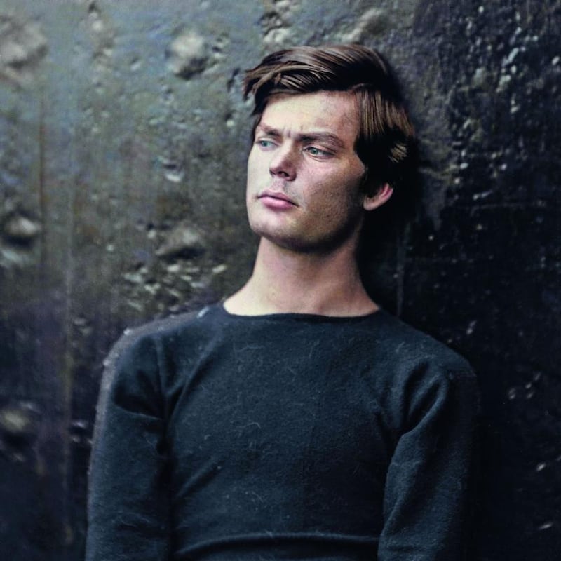
Whether the colourist's make-up adds value or not can be posed with regard to an 1865 photograph of Lewis Payne, an ex-Confederate who conspired with John Wilkes Booth to kill Lincoln and members of his government. Two different colourisations of this unique document are featured in Retrographic and The Colour of Time but the emotive modernity of Payne's features – clean shaven, affecting hairstyle, his attire and tranquil but questioning gaze – shine out from the original. Exposure time was necessarily long and Payne leans back against the gunmetal deck of the ship where he was imprisoned before the trial which led to his execution. It is difficult to see what any colourist could add to the poignancy of this moment. Its aura, "a strange weave of space and time" for Benjamin, resides in fidelity to its photographic moment – the way it owns itself – and the question is whether colourisation adds one whit of value.
Michael Carroll and Marina Amaral reach for the same metaphor when describing their work – building a bridge between different ages of photography, between the past and the present – but sometimes a bridge is never recrossed. It takes you somewhere new and the return journey is never made. The film critic Roger Ebert, criticising Ted Turner's colourisation of Casablanca, made the point that a movie can only be seen once for the first time. If a classic black and white photograph is first seen in a colourised version, has something special been lost?
Retrographic, edited by Michael D Carroll, is published by Carpet Bombing Culture; The Colour of Time, by Dan Jones and Marina Amaral, is published by Apollo