
Maison & Objet, the interior design trade fair held biannually in Paris, is the benchmark of interior style for the coming year. The January show, which has just come to a close, is one of the most important European events for brands, big and small, to meet and unveil their latest collections.
It’s a wonderful show and the highlight of every designer’s calendar. And this year did not disappoint. A key “wow” factor was the new colour palettes. It’s such a powerful tool for designers and can have such an impact on how a space makes us feel.
We’ve all had an experience of spending time in a room that made us feel uncomfortable because of lighting or acoustics, but the wrong colour in a space can be equally unsettling. Colour can make large spaces feel more intimate and small spaces feel larger. Most of all it’s the simplest way to put your own stamp on a space.
0 of 3


At Maison & Objet this year there were clear favourites when it came to colour choices . . . and grey was not one of them. The colour palettes at the show were fresh, fun and, at times, quite bold.
Blush was everywhere. It was used in so many ways that it was almost the backdrop to the show. It’s a really beautiful shade, a pale pink-peach nude tone that’s both fun and warm and yet somehow timeless. It appeared in everything from textiles to tableware. It was used as a wall colour and also featured in flooring. On many of the stands it was paired with burgundy and coral, two luxurious shades that work beautifully together.
Colour standards
Metallics are still very popular and the blush-brass combination featured a lot. Metallics were used in everything from furniture to finishes and were especially popular in lighting.
Pantone, the authority on colour standards, selects a shade every year that reflects the current cultural climate. This year their colour is “greenery”, a yellow-green hue that signifies beginnings: a fresh new year, healthy lifestyle choices, grass and the outdoors.
True to this prediction many shades of green featured throughout the show, from ceramic tiles to upholstery. Green was also introduced through planting.
The theme of nature was strong and the greenery was teamed with a pared-back palette of white and more natural materials such as timber and stone. Bottle green, in particular, was present in everything from glassware to luxurious upholstery; it works really well with blush and this combination with brass was just gorgeous.
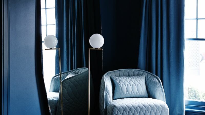
Paint manufacturer Dulux also selects a colour of the year at its Colour Futures presentation in December where its choice for 2017 is denim drift, a lovely shade of pale blue, evocative of an overcast sky or faded denim.
Blues were very much in evidence at Maison & Objet. Different shades were displayed together from dark navy to the paler, sky-blue shades, and when combined with metallics, they create a really luxurious palette.
Pop art theme
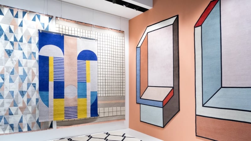
Monochrome was also popular. At Maison & Objet it was displayed in two ways, the first was very elegant and almost gallery-like in its execution. White painted walls were used to showcase silhouette-like pieces of furniture. Then there was a more playful way of working the trend, with pop art-like graphic prints featured in upholstery and rugs.
The pop art theme was also evident with striking blue and vivid yellow displayed with the monochrome black-and-white palette in a way that evoked the work of artist Joan Miró. But in a more contemporary twist these striking shades were both also paired with that beautiful blush tone, showing the versatility of this gorgeous shade.
Colour is something that scares so many people, especially when it comes to using it in their homes. However, it’s worth stepping outside your comfort zone every now and then and having a bit of fun.
A nail polish company recently ran a survey to see how its bolder nail colours were selling. It found that women were buying them, but were restricting them to their toes. It reminded me of a friend whose house is done in neutral shades, except for the tiny guest toilet whose walls and ceiling are painted in a rich burgundy. And it’s everyone’s favourite room in the house.
Denise O’Connor is an architect and design consultant


