
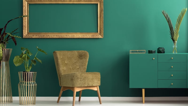
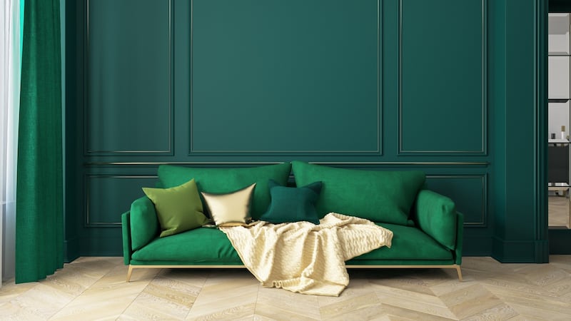
Green is good
For living rooms, while grey remains the default choice, accents of green are being introduced as a great way to add a sense of drama.
For a south-facing living room, go for a white or a grey paint with a blue or grey undertone. "These help neutralise bright light in a sun-filled room, and provide the perfect neutral backdrop," says Bronagh Page, homestyle manager at Woodies.
0 of 8


Then add depth with a wall of green. “Deep, forest greens are big right now and a south-facing, sunlight-filled living room can take a dramatic shade,” she says.
Green is good for bedrooms too. “It’s a great colour for rest and recuperation and can bring a lovely sense of balance to a scheme. Sage or olive greens are the safest I find and work particularly well with crisp white linens.”
Panelling is in, giving you even more chance to play with colour. “Panelling has become very Instagramable and works particularly well as a bedroom feature wall. Choose a dark shade of green or navy or a safe grey to set it off,” says Page.
Go big on blue
Getting the hallway right sets the tone for the whole house and right now blue is big.
“A strong colour can provide a welcoming entrance to your home with plenty of personality. Dulux’s Denim Blue can look exceptionally well when teamed with brilliant white woodwork and warm oak flooring,” says Bronagh Page.
Vintage Denim from Johnstone's Labyrinth Trend is another great option. "The average hallway would normally have natural light from the entrance door and a window at the top of the stairs, as well as multiple doors leading into other areas. Try using White Whisper on all woodwork surfaces to create enough light reflection to frame Vintage Denim on the walls," says Donna Taylor, Johnstone's colour consultant.

“Bear in mind that the hallway is also the centre point for access into other areas, so the chosen colour should also lend itself appropriately to colours in the adjoining rooms.”
The growing trend for panelling suits Lucina Lennon of the Paintmaker's House. She specialises in handmade paints and bespoke wall coverings, including contemporary chinoiserie, frescos and verre eglomise – decorative painted glass wall panels.
“People are getting a little bolder in their colour choices. Rather than the very muted colours we’ve seen in the recent past, now there is more appetite to introduce a richer palette, though the greys are still very much with us,” says Lennon.
For living rooms, her top pick is Jamestown Blue, from US paint company Benjamin Moore. "It's a lovely colour, half-way between grey, green and turquoise. It's enveloping without being too dark and it looks gorgeous in living rooms."
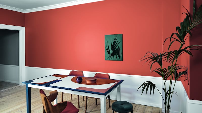
Give orange an outing
If you are opting for a blue living room, introduce an accent colour from the opposite side of the colour wheel. “Having burnt orange in a painted chair, cushion or lamp can really spice up the colour scheme,” says Lennon.
Burnt orange is "having a moment" right now, she says. "Fleetwood does a great colour in its Pantone range called Tangerine Tango."
Other warm colours creeping back on to walls include shades of ochre and terracotta.
Johnstone’s Maple Haze is taken from the orange family “which has a link with food and appetite, making this ideal for kitchen and dining areas”, says Donna Taylor, principal technical colour consultant for Johnstone’s Paint.
“It is warm and gently stimulating, reminding us of comfort. It will work in any style and orientation of kitchen space. It will pair particularly well with natural wood elements and deep and dark navy or green toned kitchen units.”
She suggests sticking with warmer hues for living rooms, such as Dusky Berry. “It is a rich-toned muted red that has a comforting quality and will create a warm and cosy environment in a dimly lit space. Alternatively, when paired with warm lighting and rustic textured furnishings in throws and cushions, a space with this colour will instantly become energising, making for a perfect setting for conversation and interaction,” says Taylor.
Join the navy
Dark colours work best for bedrooms. “Our bedroom space tends to be used as a sanctuary, somewhere to relax and wind down. It is our respite area where we intend to have hours of unbroken sleep,” says Taylor. Johnstone’s Midnight Sapphire is a great choice as it’s so dark – almost black – that it absorbs light and creates a quietly soothing atmosphere.
“If your bedroom furniture is light and smooth in texture, using Midnight Sapphire on all walls will create a calming focal point. Or, for a bold feature wall, choose the wall opposite the window as opposed to the traditional bedhead wall. This will allow light to strike the deep colour directly, creating a more intense feature colour,” says Taylor.
Get greyed-off
Ideally an exterior scheme should have a minimum of three colours with the lightest used on the coin or cornerstones, suggests Cora Collins, a colour consultant with Dulux.
Most of Dulux's exterior paints are designed to work with the stones and bricks most commonly used in Ireland. Among its most popular colours right now are Cobblelock and Rugged Shore, which she describes as "greyed-off beige".
Magnolia and yellow are out. Greyed-off tones are in.
“In Ireland we have a grey light so what works best is not actual greys, which can be too grey in this light, but other colours that are greyed-off, that is, colours that have had a little black added to them,” says Collins.
One very attractive scheme is to have the body of a house in Cobblelock, with a lighter colour such as Dulux's Achill White around window reveals and a deeper colour, such as its Merlin, for the base, which gets a lot of wear and tear.
Colourtrend has some great exterior schemes too. Try "Oslo on the main body of the house, Ben Bulben on the plinth and Classic White on window reveals and sills", says Colourtrend's Kate Walsh.
“It is perfect for adding a splash of colour on your front door also, perhaps Georgian Gold or Delicate Duck Egg.”
Cora Collins’s house is painted Dulux’s Carraig Grey on a Merlin Plinth and is so pretty it features on the company’s marketing brochures.

She too believes in having a little fun with the front door. "More and more people are painting their front doors fun colours," says Collins, whose own one is painted Raspberry Lane, or, as she puts it unofficially, "a Barbara Cartland pink".


