
Could the colour on your walls be negatively impacting your mood? Believe it or not, the colour you paint the rooms in your home can have a powerful effect on how your home makes you feel. This is because colour is one of the most significant contributors to the atmosphere in a room. So making a mistake might mean that you’ll never feel comfortable in the space.
Choosing colour can be challenging. I’ve pulled together my top five steps to follow for picking the right colour and making sure your rooms not only look great but make you feel great too.
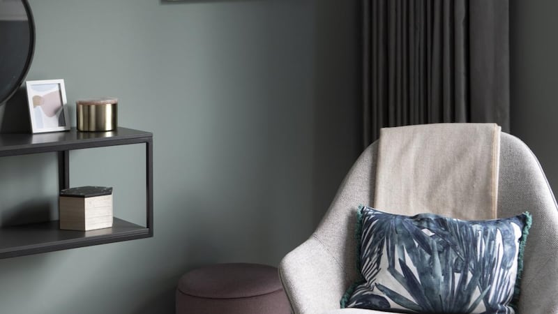
How do you want to feel?
You should choose interior paint colours based on the kind of atmosphere you are trying to create rather than focusing solely on aesthetics. By shifting the way we think about our living spaces from how they look to how they make us feel, we can dramatically improve our day-to-day lives and enhance our wellbeing.
When picking a colour to enhance a room's atmosphere, your personality will have a big part to play
When picking a colour to enhance a room’s atmosphere, your personality will have a big part to play. For example, are you someone who likes to entertain a lot, and who prefers company to spending time alone? Then you’ll likely prefer a vibrant and energised space. Or do you crave quiet time? Then you’ll be looking to create a calm and relaxing room.
What will the room be used for?
Let how you plan to use the room guide your colour selection. The colour you choose to decorate your bedroom, for example, can play a part in the quality of your sleep, so it’s crucial to select your colour palette carefully.
Warm colours will create a stimulating effect, while cooler colours, such as blues, pale greens and greys, will produce a more calming and relaxing atmosphere.
Good colour choices to benefit sleep are soft, muted shades. Darker tones such as deep plums or rich burgundies can create a luxurious and cosy environment, creating more of a cocoon-like effect. Avoid high-energy colours such as bright greens, intense reds, or bold, vibrant shades. Keep the colour for your woodwork and windows the same to create a more unified colour scheme.
Take orientation into account
The room’s orientation will have a role to play in your choice of colour too. A north-facing room, for example, will lend itself well to warmer, moodier colours and less so to crisp whites or cool greys. A south-facing room, however, can take a broader range of shades.
Be careful not to choose a colour because it looked great in a friend's house. The same colour will look completely different in different light conditions
A common mistake is painting a north-facing room yellow to brighten it. Yellows are tricky as they often react poorly in the light that comes with the Irish climate and can look cold. Instead, a more neutral shade with a hint of green or earthy tone will make the room feel much warmer and more inviting.
And be careful not to choose a colour because it looked great in a friend’s house. The same colour will look completely different in different light conditions. The colour might not work if your room’s orientation is not the same.
What time of day will the room be used most?
Think about the time of day you are most likely to be spending time in the room. It will determine whether the room is mainly lit with natural or artificial light. The light quality will impact how your paint colour looks.
Always test the colour in the room you plan to use it to see how it reacts with the light. For naturally lit rooms, steer clear of any shade with a hint of pink or peach in it. These tones are tough to live with. This is particularly true with neutral shades – magnolia is a classic example – as their warmer tones tend to clash with everything.
Instead, choose a shade with a slight hint of green as it has a neutralising effect, meaning most colours will combine well with it. The green also means it will react well in the light that comes with the Irish climate, which tends to be very soft and in other rooms with little natural light.
Test the colour in your chosen finish
Make sure you test your chosen colour in the finish you intend to use. The same shade will look slightly different depending on whether it’s matt or gloss. The sheen level alters the appearance, making the colour look lighter or darker depending on the finish. A matt finish will look very different to a gloss, for example. Often testers come in a matt finish, so if you are planning on using a sheen or gloss paint, invest in a small amount of that finish to test before committing.
Denise O'Connor is an architect and design consultant @optimisedesign


