This is a novel that chronicles James Joyce as he lies on his death bed. A writer’s thoughts on his life, his children’s thoughts on their famous father, and a final story to defy them all.
Given the breadth of James Joyce’s life, and more importantly his work – a bridge, as it were, from an older tradition to a newer one – I felt that a cover inspired by the old technique of letterpress had an intriguing potential.
Letterpress was the normal way of printing text in Europe, from its invention in the mid-15th century by Gutenburg, until the late-19th century. (The Chinese had invented ceramic moveable type in the 11th century.) Much like our digital revolution and the huge opportunities brought about by social media, Gutenburg’s moveable type changed the dissemination of information forever. Texts were no longer written by specialist scribes for the select few. Words, knowledge and ideas could be printed and seen by many. It was an invention that brought great power.
I had used a letterpress in college, and as a budding typographer was impressed by the sheer discipline, patience and respect it gave me for letterform. Today, anyone can type an essay on their phone, if they wish, but creating something in letterpress is a game of control and endurance. Fitting letters – wood or metal type – into a chase (a metal frame) is sometimes like trying to fit a square peg into a round hole. So, we use furniture (metal, wood or resin spacing tools) and various em-spaced leading in different lengths – to fit the letters into the chase.
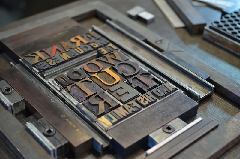
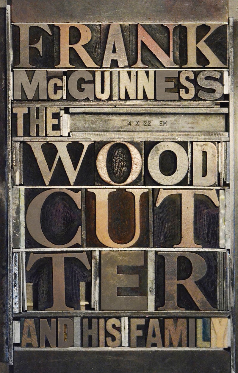
Wood type is cut and this fact tied in nicely with the title of Frank McGuinness’s second novel, The Woodcutter and His Family. I mocked up a cover approach using images of wooden type that I found online. Again, thinking about how Joyce’s work continues to connect us to an older literary tradition, I mixed a serif and a sans serif typeface. For me, the serif represents a traditional letterform and the sans serif evokes a modernist typeface. I wanted the title to fill the entire cover, so it meant breaking the word “woodcutter” over three lines.
I presented the cover draft and my approach was liked by the O’Brien Press team. Most importantly, the author himself loved the resonance that the image creates. This was progress; my next thought was when the danger loomed … I wondered if I could recreate this cover approach using only letterpress!
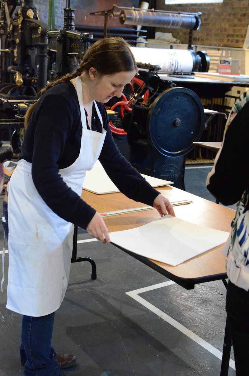
I contacted the National Print Museum and, to our delight, the museum’s education officer, Gretta Halpin, loved the idea too. We arranged for us to visit the museum early one morning to recreate the cover with wooden letterform, and the artisan compositor Mary Plunkett was to be our printer for the day.
The first thing to do was look for type. I noticed (with great relief) that there was plenty of wooden type. The museum had several drawers or “cabinets” of wooden Caslon (a serifed font) and Frutiger (a sans serif font).
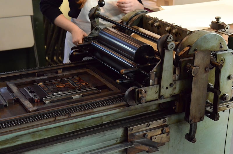
The next step was to pull out the type case of our chosen letterforms and see how they might work together. Once we had the type together in galleys we began the slow task of fitting it to the chase. The challenge here was fitting the two fonts together. This process alone took about two hours. With the type finally placed snugly in the chase, the furniture was held in place by tightening a quoin key or a locking device. The type was now “set” (hence the term “typesetting”) and we then prepared the paper by cutting it to size and brought it to the Vandercook press.
Before Mary inked up the press, she ran a sheet of paper through it to see how the type might sit, that is, where it would land on the page. A few adjustments later and the press was inked and ready for the first proof! This way we could see the position of the type, and see if anything needed nudging or moving. After a few further adjustments, we started the run.
And so the print that appears on the book cover, under the dust jacket, was born. The image on the dust jacket shows the serif and sans serif wooden type set in their chase. Something that might take 10 minutes on a computer had taken us a number of hours. These disciplined and patient hours, immersed in the letterpress process, have given me a new appreciation of letterform, and its many iterations.
My sincere thanks to the National Print Museum, and to author and playwright Frank McGuinness, for entrusting us with the cover of The Woodcutter and His Family.
The Woodcutter and His Family by Frank McGuinness is published by Brandon/The O’Brien Press nationalprintmuseum.ie; obrien.ie