John Hinde was a pioneer of colour photography and one of the most successful and prolific postcard publishers in the world.
His largest collection of postcards celebrated Ireland. In them, he portrayed an island brightened by his imagination: a place where children were red-haired and freckled, the sun always shining and the sky forever blue. His idealistic images were to become the stereotypical portrayal of Ireland for many years, and to this day elicit nostalgia from viewers worldwide.
John Hinde’s great success reflects the postwar expansion of the tourist industry in Ireland, particularly the growth of the American vacationer. Hinde promoted his romanticised scenes well before the development of digital imaging and social media. They depicted an Ireland people wanted to remember but were in stark contrast with the realities of the stagnant economy and repressed society of the time.
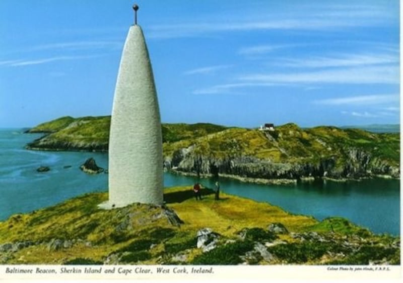
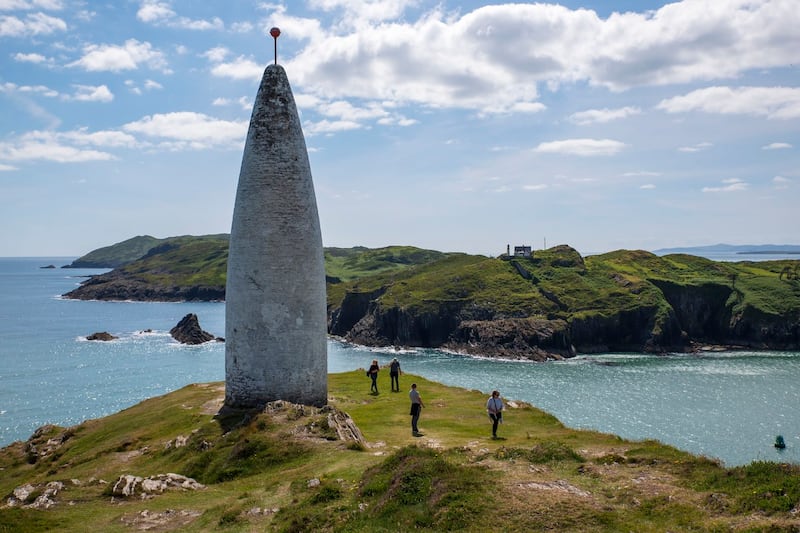
Return to Sender pairs Hinde’s iconic postcards of Ireland from the 1950s, ’60s and ’70s with corresponding contemporary photographs. The side-by-side contrast of these then-and-now photographs illustrates the ways Ireland’s rural and urban landscapes have changed over the decades or, in some places, not changed at all.
From March to October 2018 I criss-crossed Ireland, retracing the steps of John Hinde and his small team of photographers. The exact dates of the postcards here are unknown, but they were taken some time between 1956 and 1970. In most cases, I tried to recapture each postcard by photographing the same spot where the original shot was taken. However, due to newly sprung shrubbery, trees or buildings, I was sometimes unable to access the precise location for my photographs. Where my view was blocked or hindered, I tried to find the closest, most accurate position from which to shoot.
Hinde was not just a renowned photographer; he was an innovator and entrepreneur too. Like a film director, he would often stage-manage his photographs by adding people and flowers, as well as regularly painting transparencies to get a cottage, a car or a cardigan to the colour he wanted. For Hinde this usually meant bright red pullovers, Mediterranean blue skies, and yellow cars. Why red or yellow? Very simply, it made the finished cards stand out on the rotating wooden stands on which they were displayed.
As the purpose of my photographs is to provide the reader with context, I did not intentionally place people or items in the shot; neither did I add or change the colour of objects or buildings. Most of Hinde’s postcards were shot with Plaubel Junior 4×5 cameras using Ektachrome-x sheet film. I shot my photographs in RAW on a digital flashcard with my Nikon digital camera.
In addition to showcasing Hinde’s remarkable photography, I hope I’ve given the reader the chance to reminisce about an idyllic and vanishing Ireland and to show a little of what has, or hasn’t, changed over the past 60 years.
What made his postcards so special?
Hinde created a sense of nostalgia. His surreal intensification of colour was intended to make the audience form an idealised memory of Ireland. At the time, most serious photography was presented in black and white. Hinde wanted to make perfect colour photographs. Kate Burt, writing in the Independent, wrote that it was Hinde’s creative use of colour that made his postcards different:
“Hinde was an innovator in a world where serious photography was black and white, and where colour photography was poor – because neither Ireland nor Britain had the technological capabilities to reproduce the vibrant hues Hinde dreamed of. So he sent his transparencies to Italy, where technology was more advanced. Not only could the images be produced in far lusher shades than was possible over here, they also got additional help with extensive retouching, which would turn insipid sweaters, mousey heads of hair, faded sun-loungers and dull skies into dazzling points of interest. (And, more importantly, according to those who knew him, into hard cash.)”
Hinde became one of the most successful postcard publishers in the world, although critical acclaim only began in 1993, with a retrospective exhibition at the Irish Museum of Modern Art.
Today, Hinde is widely regarded as an influential figure in fine arts, design and pop culture, as well as an outstanding social documentarian. His bright, dream-like postcards have become a vibrant resource for a better understanding of the social and cultural history of Ireland in the 1950s and ’60s.
Who was John Hinde?
I had this sort of vision thing, of the top of the ladder when I was at the bottom, of fantastic colour photographs that I have never seen and that nobody else had ever seen and my whole aim was all the time how to get there, how to achieve it. You ever visualise Heaven? – John Hinde
Hinde was born in Somerset in 1916, the great-grandson of James Clark, the founder of C&J Clark Ltd, the famous shoemakers. At the age of three, he developed an illness that left him with a permanent disability in his left leg. After a brief apprenticeship in the family shoe business, and then with a Bristol architect, Hinde went on to study colour photographic printing at the Reimann School of Art and Design in London. He became a member of the Royal Photographic Society in 1943.
During the second World War, Hinde was a war photographer covering the Blitz, and for the rest of the 1940s was preoccupied with the reproduction of colour photographs in books. Of particular interest was his work with Adprint, where he photographed for Britain in Pictures, a series published by William Collins, as well as A Fire Guard Life (1944), Citizens in War – and After (1945), Exmoor Village (1947) and British Circus Life (1948).
Throughout his career, Hinde’s essential trademarks were his attention to detail, his intensive use of colours and his mastery of photographic technique. His work in the 1940s was groundbreaking, with his colour photographs being recognised by London’s Imperial War Museum as the only examples of such photography from the war.
Throughout my childhood, the sender of these postcards was my father, Patrick Kelly. Born in Co Roscommon, he emigrated to California in the early 1950s. Throughout his life he revisited Ireland often and sent his young family a steady stream of postcards – glossy milestones to measure his quest for historic and natural wonders in the country he always held dear.
When I was nine years old I started travelling with my father on many of his visits back home, to Westport House in Co Mayo; the stern beauty of Bunratty Castle in Co Clare; grey Kylemore Abbey in Connemara, Co Galway, wreathed in green. He wanted to show me the places and tell me the legends, to build memories that would last a lifetime.
My father died in 2015 and, in 2018, I came back to live in Ireland with my family. Return to Sender is my tribute to John Hinde, whose jewel-bright Ireland was the stuff of my childhood dreams. It’s also a tribute to my father, who instilled in me an almost mystical feeling for Ireland’s beauty. Revisiting these scenes, it doesn’t matter that the skies are often slate-grey, the grass rarely deep emerald, or that sunshine-yellow cars are as rare as flaming-red pullovers. Without artifice, transformed and yet true to its past, the magic of Ireland is still there for me.
Return to Sender by Paul Kelly is published by Gill Books, priced €19.99