
Two big design fairs that take place every January: IMM in Cologne, and Maision et Objet in Paris, are the highlight of every designer’s calendar and they set the tone for the year to come. From colour to finishes here is a selection of the trends you can expect to see more of in 2018.
Green
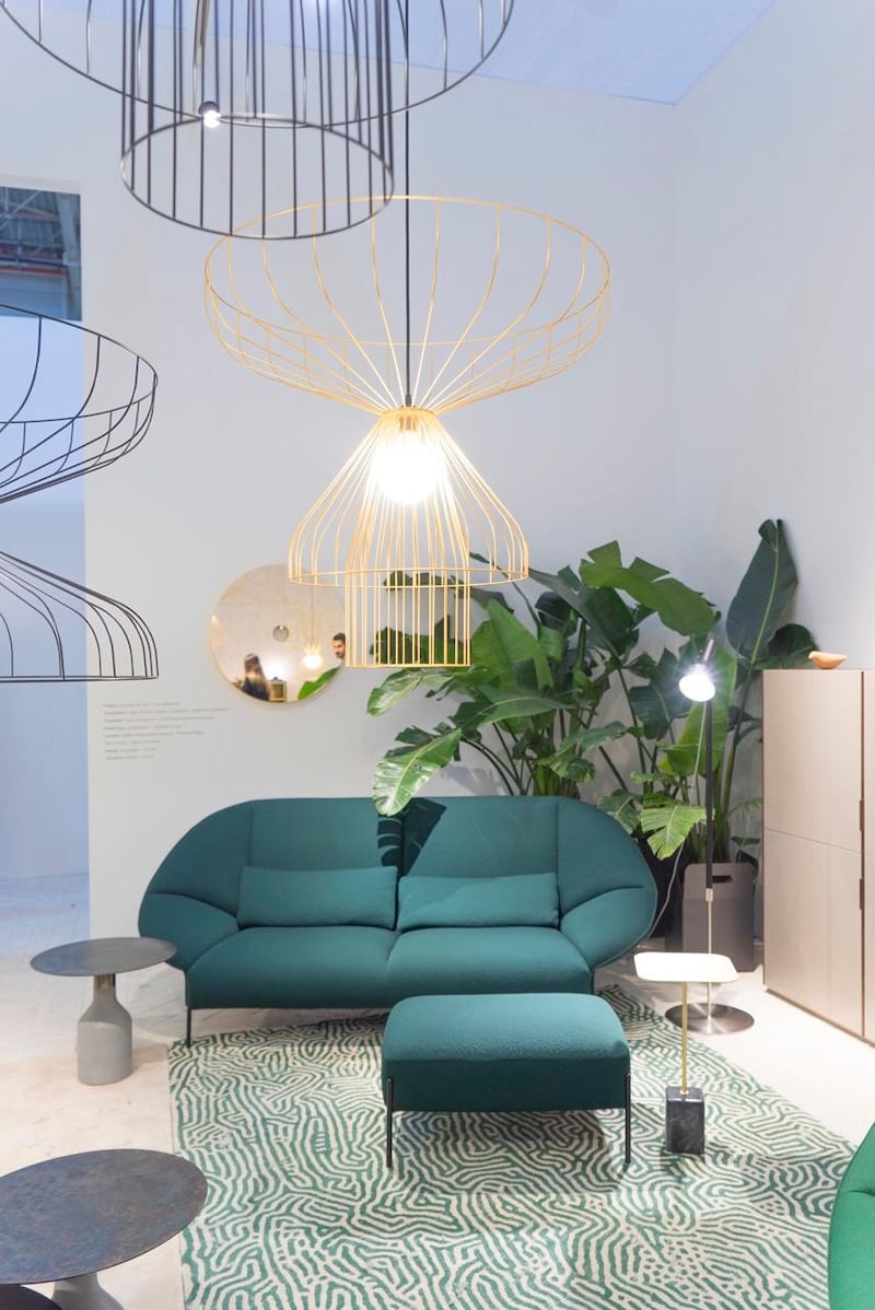
This year green was the star of the show at both IMM and Maison et Objet. It featured in everything from upholstery to furniture and varied from rich emerald hues to soft sage tones. The darker shades were paired with navy and sapphire blues (who said blue and green should never be seen?). The paler sage tones were paired again with darker greens and dusty coral tones. Layering of the same colour was also popular with entire room sets in a single colour, creating really atmospheric and dramatic schemes.
Black and White
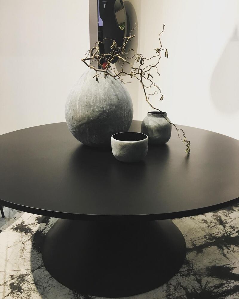
Black and white is popular again this year and was presented in a very soft and accessible way. Texture played a big part in softening this monochromatic palette. Large black furniture pieces were accessorised with roughcast pottery and beautiful silk rugs. Accent colours were not introduced at all and the result was a really confident and sophisticated colour pairing.
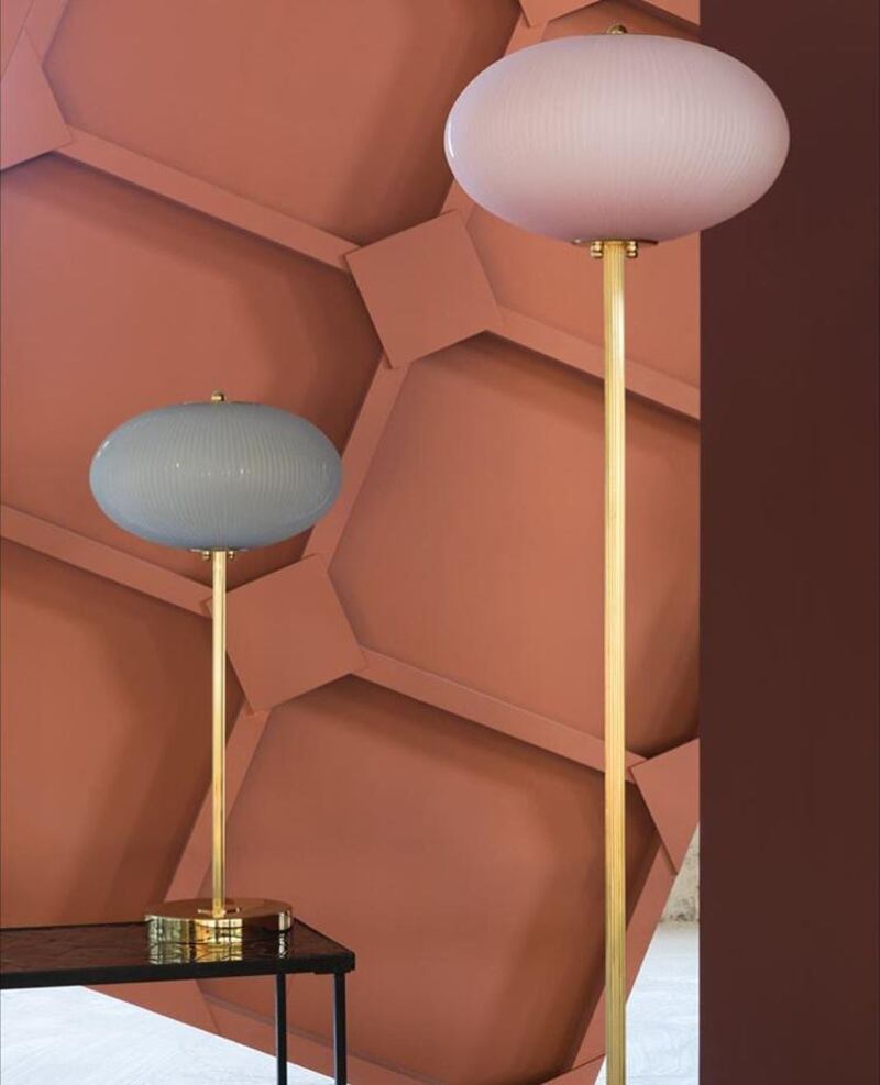
Burnt Coral
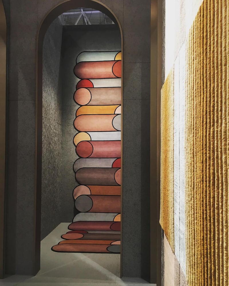
Millenial pink or blush was replaced by what I would describe as a burnt coral. This is a much more muted version of these lovely warm pinky tones and it brought an autumnal feel to the schemes it was used in. It paired nicely with burgundy, copper and paler sandy tones and also worked wonderfully with green.
Heather
Every year, Dulux gathers a panel of global experts to forecast the colour palettes that best reflect the way we want to live and select a much anticipated colour of the year. This year that colour is “Heart Wood” a warm smoky cocoa neutral with a hint of heather. It was evident at the shows in January and featured strongly in upholstery in particular. Layering of similar shades and tones was popular and texture was used to create contrast.
Wallpaper
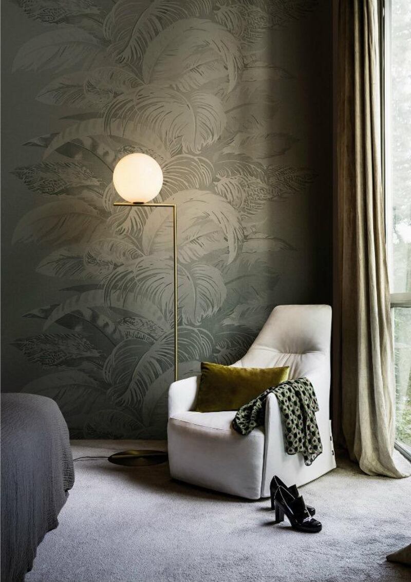
Wallpaper was very popular this year. Florals and leaf prints featured heavily and many of the prints were oversized. Plain patterns were used in place of paint in many room sets. It was nice to see wallpaper making a comeback as it’s such an easy way to add personality to any room in a home.
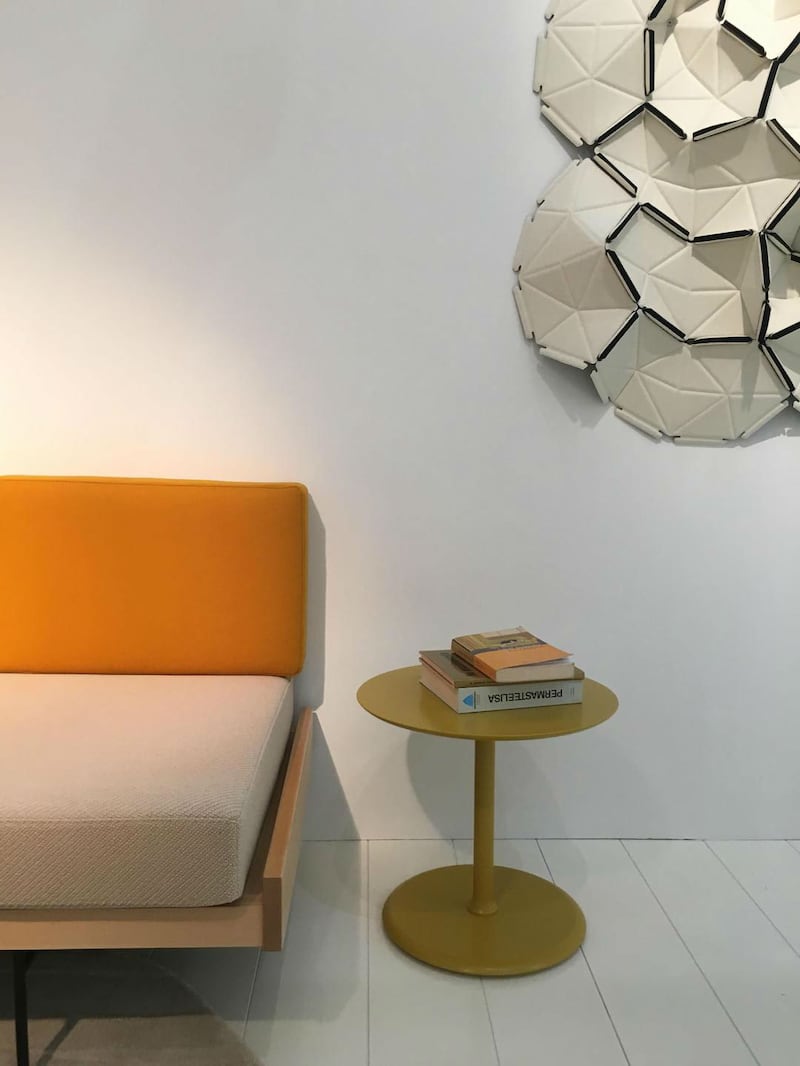
Yellow

Yellow featured throughout the collections, it was more of an accent than a hero shade and the hue of choice was a soft egg yolk shade almost pale amber in tone. It featured in everything from furniture to flooring and paired really well with the blues and rich burgundy.
Blues
Blues were very popular again this year and a variety of hues were on display from dark navy to dusty paler shades. All blue room sets were really popular. Rich dark blue velvet furniture pieces were accessorised with pale blue cushions and throws in wools and cottons creating a really luxurious and tactile scheme.
Leather
Leather hasn’t been very prominent in recent years but this year it was represented in force. There were leather tables, flooring and occasional pieces as well as leather-upholstered sofas and chairs. What was really lovely though was the array of beautiful shades that this gorgeous material was displayed in. There were powdery purples and pinks, dark earthy greens and natural tans and buff colours.
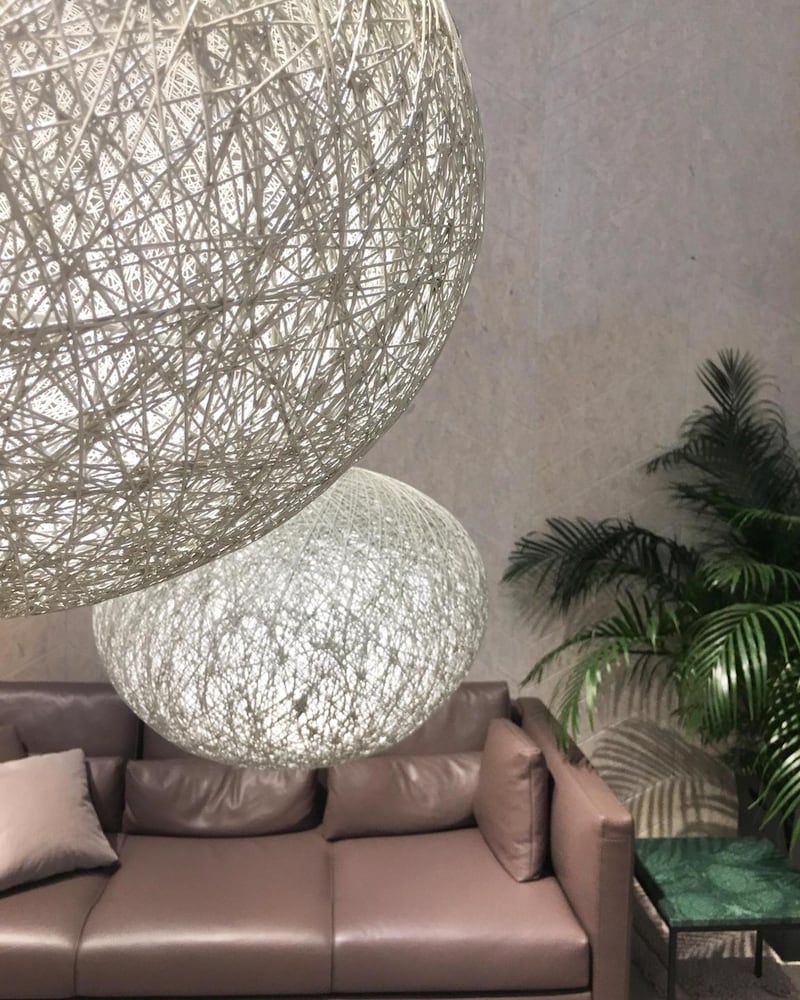
Natural materials

Many of the furniture pieces had an almost artisan feel. Natural finishes like timber and basket were popular and the tones were pale and the detailing exquisite. The pieces seemed somehow ageless and could easily have been from a previous era yet would happily work in a home for many generations to come.
Metallics
A staple of interiors for a long time now this year they have evolved from stand alone pieces to enhancing or embellishing other furniture items. There were marble tables with beautiful brass inlay details and timber sideboards had stunning bronze ironmongery. Tinted mirrors in bronze, copper and gold blended beautifully with the warm colour palette and autumnal shades.
Denise O'Connor is an architect and design consulatant @optimisedesign


