
Chicago-born, Dublin-based architect Ryan Kennihan isn't one for playing by the rules. Far from despairing when he enters a period house with the original features removed, he relishes the creative freedom that a relatively blank slate can offer.
“We all love those period features, but when you don’t have them, clients feel a bit freer to try more innovative ideas. It offers more lateral ways of thinking about the house, mainly because you’re not worried about ruining the cornice lines or anything. You get to connect to how a person wants to live in the house, without it bearing the weight of that period.”
Likewise, he likes to side-swerve the current trend in Irish house extensions, many of which use wall upon wall of glass, and clean visual lines involving sheets of white plaster.
“For me it’s about the material texture as much as possible,” he notes. “The trend of using as much glass as you can is great, but I suspect it’s a passing trend of sorts. Different textures make a house feel more permanent, and makes them feel more organic, like it’s always been there and not so ‘designed’.”
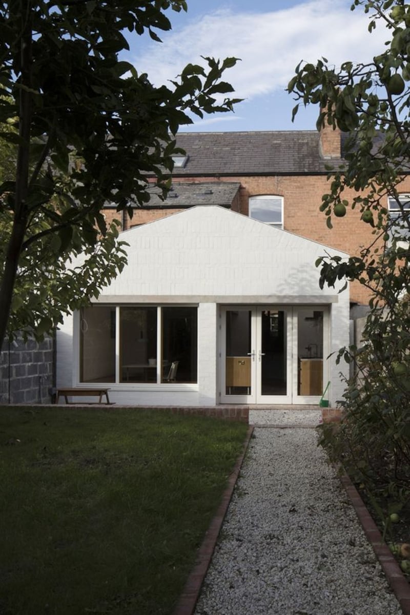
Catherine’s House is a two-up two-down terraced redbrick in a quiet cul-de-sac in Dublin 8, built at the turn of the last century. Its owners, a professional couple with a growing family, wanted to expand their 97sq m home by remodelling and extending the ground floor.
The initial plan was to do away with the house’s original kitchen extension and downstairs toilet, and to create a visual flow through the sitting room at the front of the property, through to a playroom, which was once the rear room in the house. Similarly, a doorway has been created in the wall between the playroom and the kitchen area.
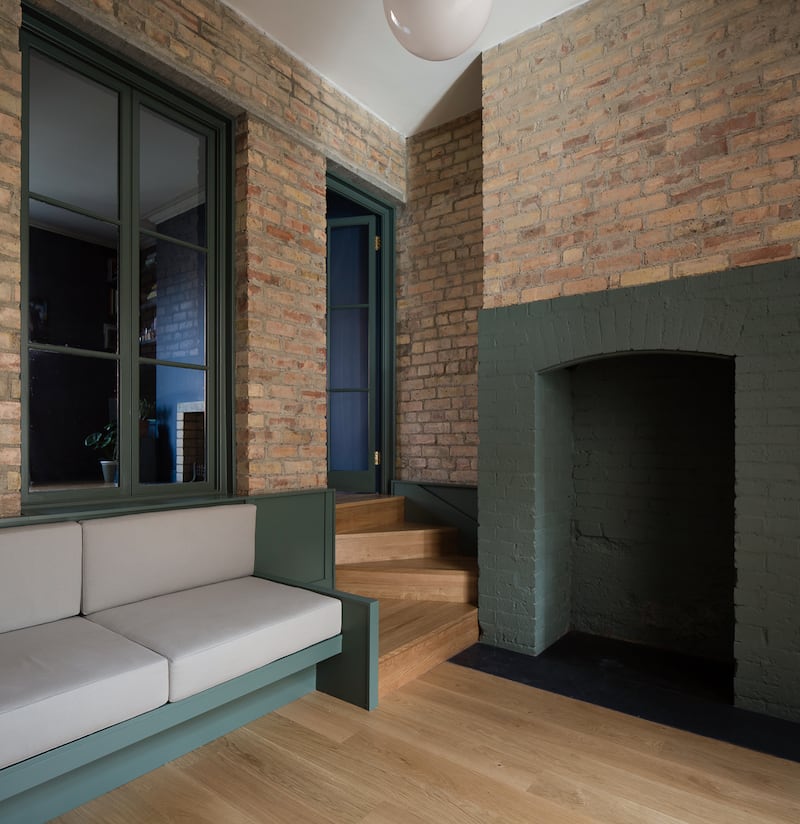
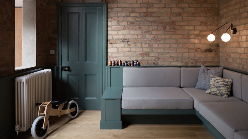
Both the sitting room and playroom are on different floor levels, giving the playroom a “sunken” feel. In the new layout, the house’s old back room became the playroom at the centre of the home.
“This house had a very interesting layout in that the back room was lower,” explains Kennihan. “We got to take advantage of that interesting level change and turn it into a feature.”
Both rooms had previously been separated by a white plaster wall, but thanks to a series of what Kennihan calls “surgical cuts”, new access between the two rooms has been created. A set of winding steps into the playroom, accessed through a new glass doorway, as well as a window cut specially into the wall, offers a sense of continuity, while also helping to distinguish the rooms as zones in their own right.
“A lot of extensions are this ultra-modern thing, but here, the rooms might relate to each other a bit more,” observes Kennihan. “Open plan can feel too ‘open’ and sterile, but you don’t want the separate rooms to feel closed off, either. This way, there’s more of a conversation between old and new.”
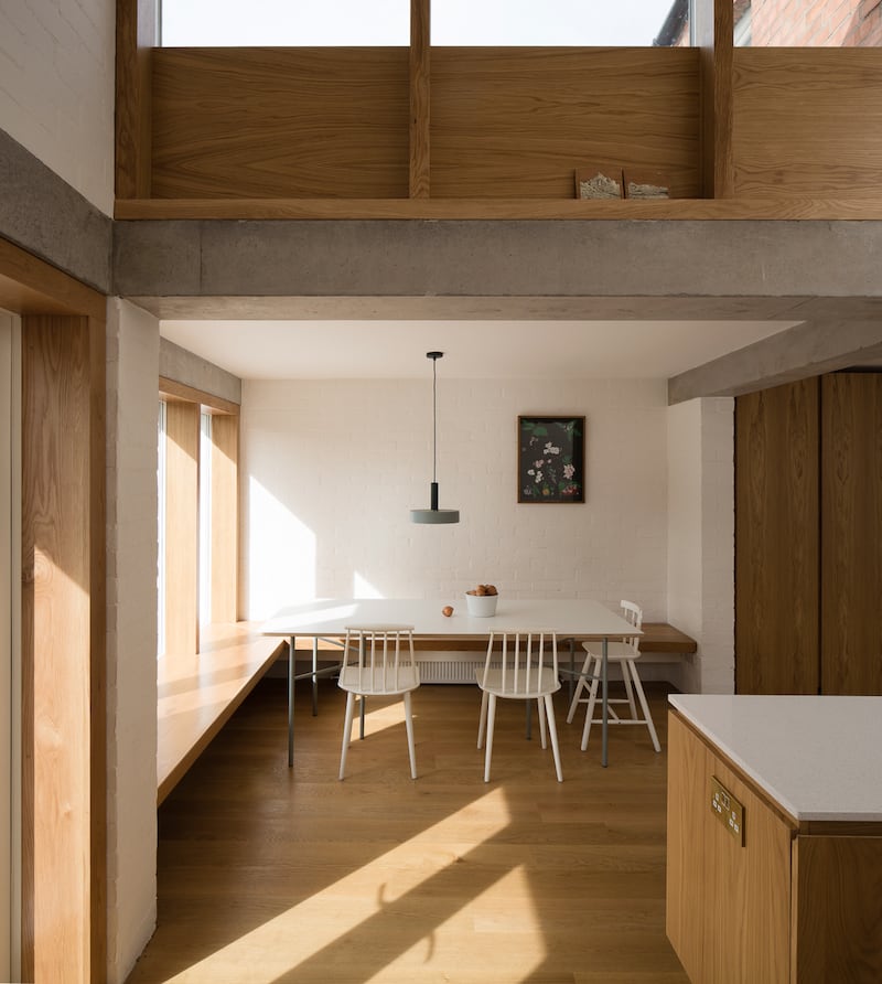
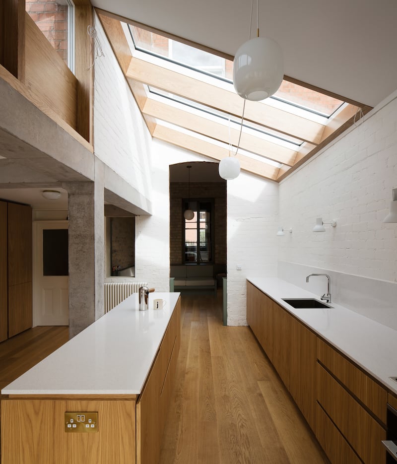
With the help of a blessedly generous back garden, Kennihan was able to add 22sq m of space to the ground floor in the kitchen/dining area to the rear (the downstairs toilet has been repositioned in a space under the hallway stairs). Thanks to well-positioned skylights and a gable, the kitchen is flooded with light throughout the day.
The gable design allowed the project to be done as an exempt development: “Not only were we able to get a fantastic amount of light into the kitchen and middle room, but it’s not so imposing for the neighbours.

“We wanted to get the west light into the kitchen,” explains Kennihan. “The light changes through the day, with cooler morning light coming up through the roof light.
“There was the classic question, ‘Do you extend all the way across the back of the house?’” recalls Kennihan. “Often, this can make for a slightly darker middle room, but by putting in the roof-light in the kitchen, we’ve been able to make the middle room moodier, and more textural.”
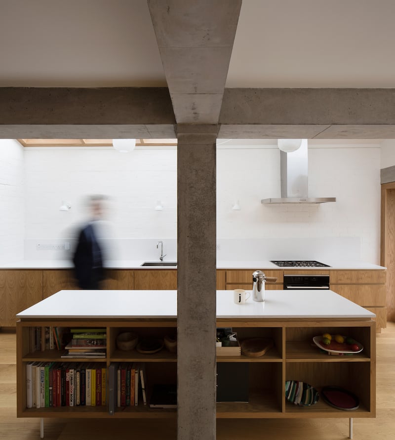
The kitchen certainly has an airy and spacious feel. With a custom-built sizeable island and terrazzo countertops made of silestone, and a wall of integrated storage space in oak veneer (installed by Terry Doyle Woodcrafts), the kitchen and dining area appears more spacious than many other terraced house extensions. Pendant lights by Louis Poulsen, a dining table area featuring Hay chairs and Ferm Living fixtures also help to create an industrial, almost loft-like feel – a trend that shows little sign of burning out and becoming a victim of its own ubiquity.
Elsewhere in the house, the family bathroom on the first floor was renovated with Laurent fixtures, and other features from Bath House in Monkstown. In a bid to "date-proof" the bathroom's design, square ceramic tiles have been arranged in a running bond and finished with a black trim.
Kennihan’s decision to strip the downstairs rooms of plaster to reveal the original brickwork also helps to create a sense of layered richness. Concrete beams have also been left in their original unpainted state, while the brickwork of the new kitchen/diner was painted white to create a calming atmosphere. The stripping away of plaster also yielded a nice surprise in the playroom: an old range fireplace not seen for the best part of a century.
To the front of the house, and thanks to "many hours" spent in Farrow & Ball, the rich, dark blue hues of the sitting room give way to a calming mint green.
“Now, the parents can be in the kitchen cooking, and still be able to see the place where kids play,” explains Kennihan. “Even if you’re sitting at the dining table, you are able to see right through to the sitting room. This way, the playroom has a great connection to the rooms on either side, so that it feels like a central part of the house. This way, we haven’t ended up with the preserved room that you find in many period houses – ones that often we don’t end up using.”
- For more information on Ryan Kennihan, see rwka.com


