The colour yellow will never feel the same. No longer just the colour of jaunty raincoats and the giant Ikea sign, yellow is now the reminder that we are still supposed to be vigilant for Covid-19.
There are yellow signs in the windows of shops, yellow signs at the park, yellow signs at the playground, yellow signs at the bus stop. There are even yellow marks on the pavements in case we can’t visualise what two metres apart might mean.
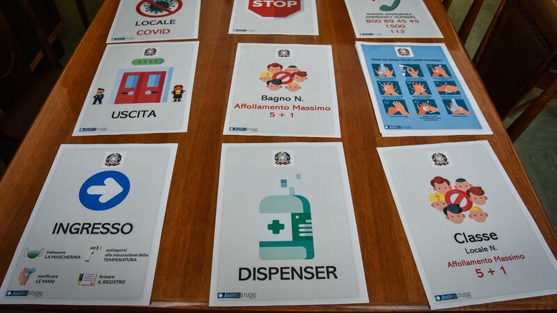
Despite being a historian attuned to the social and cultural context of visual expression I had somehow taken that yellow was a kind of universal Covid colour. It wasn’t until I started looking at official Covid-19 signage from lots of other places that I realised how different our signage is.
REMINDER: Keep AT LEAST one Springsteen of space between yourself and others pic.twitter.com/OHiYgGzdo2
— New Jersey (@NJGov) April 10, 2020
It is more uniform, more easily identified and definitely more yellow than any other signage I have seen. We do not have signs telling us to keep one horse apart (Saratoga Springs, NY) or three geese apart (Toronto) or, my personal favourite, one horizontal Bruce Springsteen apart (New Jersey). For the Bruce signage they had to include his raised arm because he is not 2m tall.
There is an interesting history to the signs societies have used to give public health messages. Historians have traced ideas and attitudes about disease and society using posters like our ubiquitous yellow Covid ones.
During the 19th century most public health notices had no images, they were simply text. Broadsides during the outbreaks of cholera in Dublin reveal plenty about the concept of disease that prevailed and how it changed over time. During the 1830s and 1840s, the notices warned about the dangers of eating too much fresh fruit and consuming too much alcohol.
By the 1866 outbreak the Dublin Corporation advocated boiling water while still advising against intemperance and filth. A quasi-bacterial message had been combined with older ideas about staying healthy.
By the 20th century, contagious diseases such as tuberculosis were more clearly linked to the dispersal of germs. The public health advice appearing in posters assumed wider public understanding of these scientific ideas. Posters popular in Ireland admonished people not to spit because it was "offensive and dangerous" by "scattering the germs of disease".
They also tried to dispel long-held beliefs that tuberculosis was genetic rather than contagious and that the disease could not be treated. Across Europe, a particular concern with tuberculosis in children is reflected in their appearance in these posters. Tuberculosis itself was represented as a spider, a snake, an octopus, a reaper and, at least once, as a hairy green bug the size of a child.

The posters that didn’t appear in Ireland are almost as revealing as those that did. While the rest of Europe and America was engaged in a visual war against syphilis and gonorrhea, Ireland pursued the eradication of sexually transmitted diseases while trying to avoid drawing much attention to the fact.
Starting in the early 20th century and expanding during the two world wars, public health posters elsewhere laid gender politics bare. STDs almost always appeared in the form of tempting women whose lovely exterior disguised their danger. American GIs were warned that “good-time girls” who only looked “clean” could prevent them from beating the Axis.
What do our yellow Covid posters say about us? Any analysis at this stage would be partial and premature but here are a few thoughts. The uniformity does reflect the centralised and co-ordinated response here in comparison to, for example, the scattered and devolved responsibility in the US. The infographics are plain and clear and repetitive. The authority of the government is stamped in one corner and the authority of science (in the form of a picture of the virus) in another.
What is usually absent from the posters is what was often crudely present in the posters of the past. Any message appealing to the heart rather than the head (#inthistogether, #protecteachother) loses potency when stamped above widget people rather than real ones. The universality of the posters makes them as impersonal as they are clear. It will be for some future historian to determine whether this has had any impact on compliance with the measures they contain.
Dr Juliana Adelman is assistant professor in history at Dublin City University – @AdelmanJuliana


