
A pair of Irish designers have had their posters chosen for a high-profile marketing blitz in New York City, that is currently on display in the Big Apple.
The recently-launched WE LOVE NYC campaign, inspired by the iconic logo from the 1970s, picked three works by Dublin-based advertising creatives Maxi McDonnell and Faye Larkin for a citywide poster campaign that features submissions from around the globe.
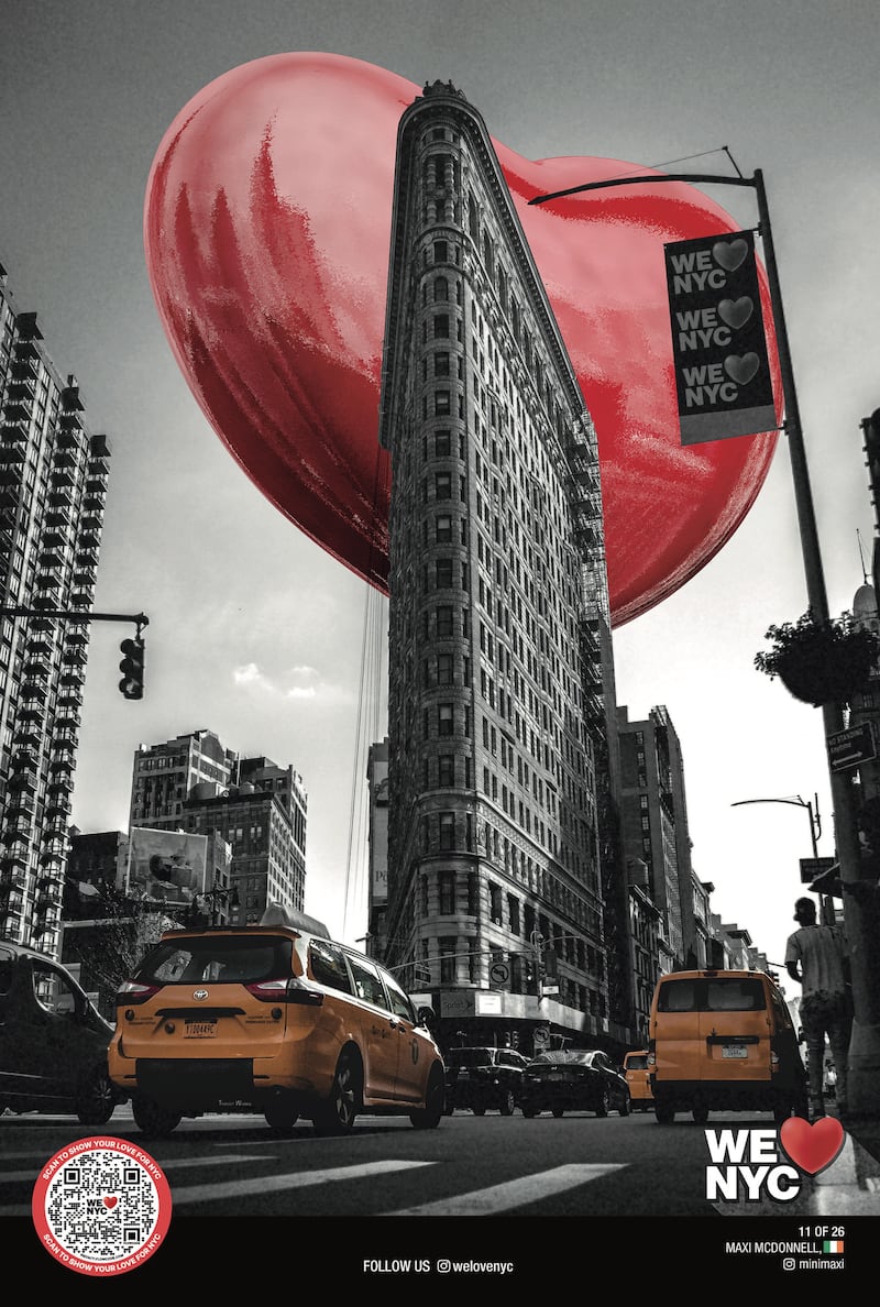
McDonnell travelled to New York to see in person his two posters entitled Heartzilla, which depict a giant heart floating over the Chrysler Building and the Flatiron Building.
“It’s surreal, goosebumps,” McDonnell said. “I came here thinking it’s going to be maybe on a couple of those slide poster sites. We walked into Times Square – it’s everywhere.”


His two pieces and one poster by Larkin, along with two dozen works by international artists, will hang in six windows at the famous Macy’s department store in midtown Manhattan for six weeks, and copies will be posted up in the streets across the city’s five boroughs.
New York government, business, and labour leaders unveiled the WE LOVE️ NYC campaign on 20 March with the goal to inspire civic engagement and volunteerism in the city to boost its ongoing recovery from the Covid-19 pandemic, which devastated the metropolis three years ago.
The heart-themed motto is supposed to hearken back to the I LOVE NY logo designed by Milton Glaser 50 years ago, which became a symbol for optimism in New York during tough times. That five-decade-old marketing effort was part of a state tourism campaign at a time when the city was tackling financial collapse, high unemployment, rising crime, and hundreds of thousands of residents were fleeing to the suburbs.
The new design for the 21st century looked to tap into that same optimism, but the rebrand received scathing reviews online and in the media within hours of its release. Critics mocked the logo’s stacked characters and heart floating off-centre, and questioned why anyone would feel the need to reinvent the 1970′s Glaser original in the first place.
The Partnership for New York City, the consortium of business and corporate executives behind the effort, tried to take the backlash in its stride. The campaign ran digital billboards above Times Square in response that read, “WE ❤️ CRITICS, EVEN IF THEY DON’T LIKE OUR LOGO.”
The city’s mayor, Eric Adams, who had joined the launch event last month with governor Kathy Hochul, shot back at naysayers and even joked that he was thinking of getting a tattoo of the slogan.
The brouhaha is all part of what makes the campaign so New York, according to McDonnell.
“It’s created a lot of debate, it wouldn’t be New York if it didn’t. It’s controversial,” he said.
The passionate feedback reminded him of his native Dublin.
“It’s just an attitude, there’s a real attitude in Dublin as well. It’s edgy, and New York definitely is the same,” he said.
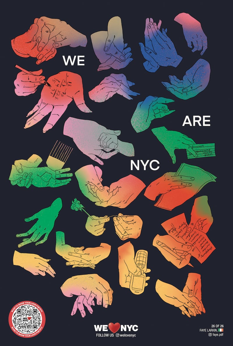
Larkin’s poster is called The NYC Touch and captures the diverse characters of New York through an array of hands in different configurations.
“I started thinking about the different characters that live in New York and the way that it’s such a space for everyone,” she said. “Everyone will find a space to belong in New York and that’s a really beautiful sentiment.”