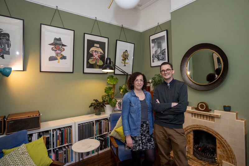
After 10 years in London, architects John and Kitty Dobbin moved home to Dublin in 2017. The couple bought a house in Phibsborough on the northside of the city, which, John says, was “liveable, but only just”. The location near the city centre was key, but it was the style of the property that particularly attracted the couple. John calls the late Victorian redbrick terraced house a “parlour house”, a type common in Dublin’s inner suburbs. Single storey to the front, two at the back, the room that attracts many buyers to this style of house is the living room to the front – the parlour room – with its high ceiling and features more typical of far grander period houses.

“It’s a perfect cube,” says John of the room’s aesthetically pleasing proportions and indeed it is the room’s high ceiling that makes it feel particularly spacious. The couple waited two years before undertaking the renovation, making some cosmetic changes along the way to make the house more comfortable – which means doing the things you’re not supposed to do, he now says ruefully of the waste of money.
It also, however, involved improvements that needed to be done, such as replacing the aluminium frame door and window to the front. These now ugly and horribly energy-inefficient features were probably seen as significant upgrades when they were installed decades ago by a previous owner, as too was the 1950s tile fireplace in the parlour room, which replaced an undoubtedly more handsome cast iron and slate chimney piece that would have been original to the house. For many young renovators, the fireplace would have been the first thing in the skip. While John acknowledges that it is incongruous – “but in a nice way, I just couldn’t take it out” – one of the reasons for keeping it was that it reminded him of his grandfather’s house while growing up.

It’s this sort of considered thinking, that looked to balance the need to modernise the house with its history, that underpinned the couple’s approach to what, once they started, was a major renovation project that involved constructing a new extension to rear.
Shed Distillery founder Pat Rigney: ‘We’re very focused on a premium position but also on giving value for money to consumers’
Mona McSharry enjoying the scenic route after realising her Olympic dream
The power market should reflect that renewable energy is cheaper
Wake up, people: Here’s what the mainstream media don’t want you to know about Christmas
Built in the 1860s, John says census figures show the house was once home to a family of nine. In its original layout, the parlour room is to the front, off the hall; there are two bedrooms facing the rear up a half flight of stairs, and down a half flight are the rooms at the back of the house where a long single storey extension was added by a previous owner. Families nowadays can often find the layout of these type of homes challenging to reconfigure – not least because figuring out where to put the bathroom can be difficult. When they moved in it was in the rear single storey extension, which in practical terms, can mean quite a traipse in the middle of the night from the upstairs bedrooms.

But, given their professions and having lived there for some time before the first hard-hatted builder arrived, the Dobbins had a very clear idea of what they wanted for their family of four – the couple have two young children, Artie and Joey – and how it could be achieved. They shared the job; Kitty was the client during the design phase and then was on-site during the building process, project-managing the build, while John became the client visiting and assessing progress.
And while everyone who has undertaken a major renovation involving knocking walls and digging foundations will remember the horror of the moment when the house is torn apart and it feels as if it will never be right – John wasn’t slightly fazed at any point, even when the entire back wall, from floor to rafters, was taken away while the extension to the rear was demolished. He admits it did look dramatic but, in the end, taking the back section of the house away saved time and money, allowing the builders clear access to both floors and to fully integrate the new single storey extension into the build.

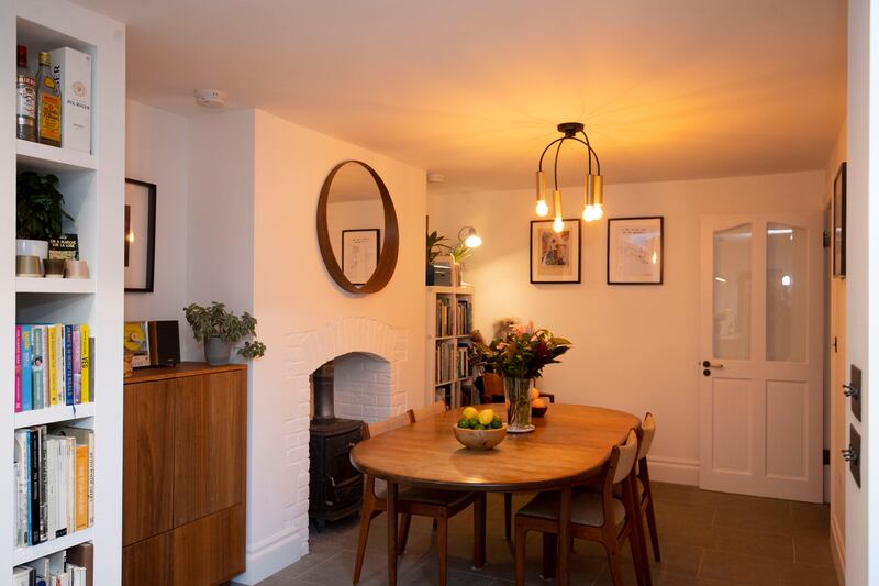
Now the extension, with its floor to ceiling glazing, contains the couple’s bedroom and bathroom, the kitchen, utility and a family room, and is a modern contemporary space. John talks of the slow transition in terms of interior design between the old part of the house to the front and the new space to the rear. The tiny guest toilet for example, under the stairs, playfully nods to an earlier era with its William Morris wallpaper, while the couple’s own bathroom in the extension is sleek and modern. Larger elements such as wall paint colour schemes – rich hues in the old part of the house, white in the new – and small details such as brass light switches and door handles give way to stainless steel. It is, as John call it, “a slow transition” to modern finishes.

One of the most beautiful rooms – and arguably the one that gives away that this is a house of two architects – is also its smallest: a colourfully tiled, tall-walled shower room to service the two children’s upstairs bedrooms. The distinctive feature of the timber-clad room, built on the roof of the extension, is its entirely glazed, frameless ceiling, a lightbox for stargazing.
Bathrooms are a big decision in a renovation, and so too the kitchen. The simple dark grey units, topped with a grey composite perfectly designed to suit the space, were sourced from TimberCraft in Dublin, which the couple praise for quality, installation and – “its mid-range in terms of price” says John. The kitchen was one of the many elements the couple decided on and sourced before the build began, because, as John points out ,“as architects who have worked on many projects, we knew how disruptive a delayed delivery of an order for tiles or sanitary ware can be”. It was a strategy that worked. The entire project came in on budget and ahead of schedule, finishing in five months instead of the estimated six.
The highs and lows: “Having a home which is uniquely tailored to our family life, with every square inch considered in its use. Not too many lows, but the impact of Covid on our programme and inflation of construction costs were pretty hard to navigate around.”
Biggest mistake: “We tried vainly to keep some internal walls, which had some of the original Victorian wallpapers. We really should have just admitted that these would have to go and saved ourselves the additional cost.”
Biggest win: “Finding the right contractor in Marius of Andrei Construction and having an ideal professional relationship with them. Make all of your decisions ahead of tendering and do not change your mind, as nothing infuriates a contractor more!”
Best advice: “Hire a professional architect, structural engineer (Robert Barry Consulting Engineers) and quantity surveyor (Russell Lincoln Quantity Surveyors). They will save you more money than their fees and boatloads of stress. Even then, prepare to roll with the punches when things sometimes go wrong.”


