The Visual History of Type is a definitive survey of the major typefaces produced since the advent of printing with movable type in the mid-15th century to the present day. Arranged chronologically, more than 320 typefaces are faithfully reproduced in the form of their original type specimens or earliest printings, located in their historical context through brief overviews and descriptions of the key characteristics of each typeface. Here, I outline five typefaces that represent major paradigm shifts in the field of typographic communications.
1454: Gutenberg’s Bastarda
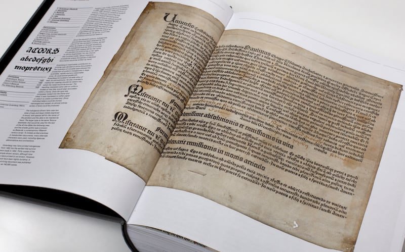
Popular tradition has it that Johannes Gutenberg invented the art of printing in the early 1450s. However, Gutenberg certainly did not originate either the press or the printing process but was the first to implement the practical use of movable type, not initially for the superlative 42-line Bible for which he is renowned but for much more pragmatic business purposes.
Since the 11th century, indulgences had been awarded by the church for the remission of sins. This involved costly, labour-intensive procedures where monastic scribes would write thousands of identical documents by hand. Gutenberg’s decisive contribution to printing – and to the direction of Western culture – was devised to solve this commercial problem. The invention of type in the form of single letters cast on individual bodies allowed the reproduction of uniform documents in huge quantities, rapidly, adaptably, accurately and, above all, cheaply.
1501: The Aldine Italic
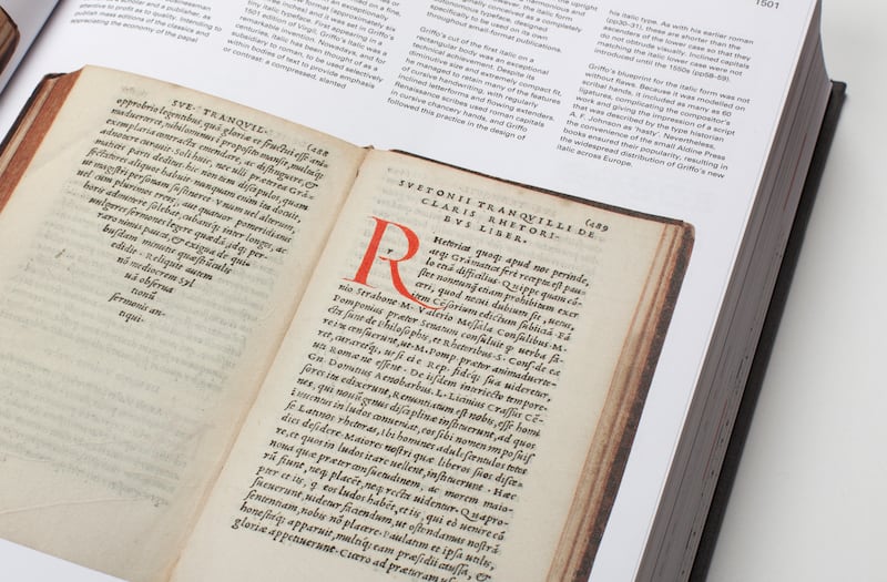
Towards the end of the 15th century, when most printed books were as large and unwieldy as the medieval manuscripts they had begun to replace, the publisher Aldus Manutius commissioned Francesco Griffo to cut a compact, inclined letterform. Easily legible at tiny sizes, the Aldine Italic allowed Manutius to produce small, affordable, portable books designed for a burgeoning class of educated, literate individuals for whom reading was beginning to become a reflective, personal activity.
Over the next three centuries, the new practice of publishing completely transformed Western society and culture. By permitting texts to be reliably reproduced and disseminated in almost limitless time frames, it triggered new ideas that profoundly challenged all forms of institutional control, leading to dramatic religious conflicts and reforms, radical socio-political changes, and to the scientific worldview that initiated the modern era.
1695: The Romain du Roi
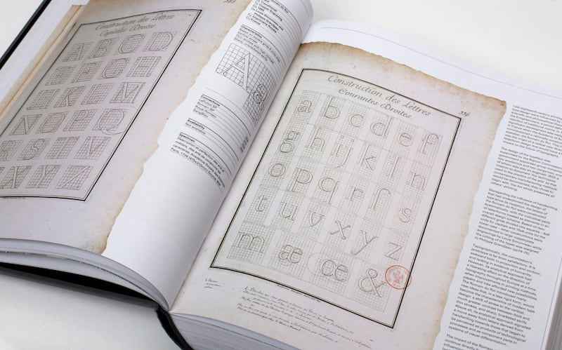
In 1692, the French Academy of Sciences commissioned a rationally constructed alphabet, the Romain du Roi. This ambitious initiative was the starting point of a radical new direction in letterform design that would have a huge impact on the future of typography. For the first time, disregarding the influence of handwriting that had underpinned the design of type since its inception, letters were constructed mathematically, with their individual parts treated as elements coordinated within a larger overall design scheme.
The Romain du Roi introduced many innovations that would become the hallmarks of modern type design: a shift of the balance of thick and thin strokes to the vertical, much greater contrast between them, and knife-sharp serifs at their endings. Above all, its analytical approach signalled a move away from letters derived traditionally from handwriting towards those that began to be perceived as products of mechanical processes and as component parts in visual systems.
1832: Figgins’s Sans Serif
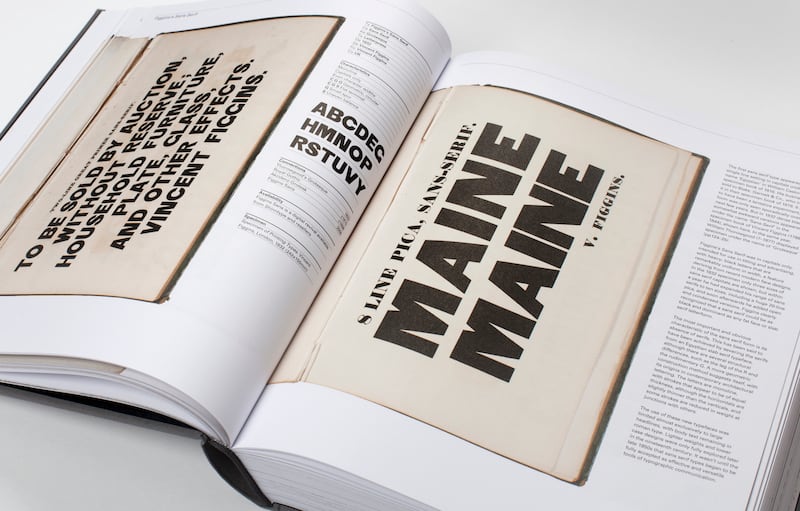
From the turn of the 19th century, increasing commercial competition required type to work harder on posters and hoardings in the dense, fast-moving environments of industrialised cities, where for the first time it had to shout in short bursts in order to compete for attention. This resulted in a proliferation of many novel, bold faces, many of which were very short-lived. However, a few, such as the sans serif style, had a permanent influence on the development of visual communication. The first typeface without any serifs at the ends of its strokes appeared as a single line of capitals under the name “Egyptian” in a Caslon specimen book of 1816. These even, heavy letters are thought to have originated in architectural lettering. There is scant evidence of these forms being used commercially until 1832 when dense, black, somewhat clumsy capitals of a similar style appeared under the name “Sans-Serif” in the specimen of Vincent Figgins, who subsequently pioneered its further development.
1967: New Alphabet
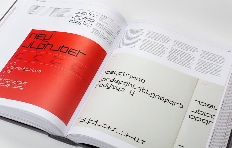
In the earliest days of the use of computers for text communications, Wim Crouwel decided that it was vital to create new letterforms for new technologies rather than developing the machines to conform to pre-existing design tropes. He created the New Alphabet to verify his proposition. Radically innovative, it was intended as a provocation to designers to stimulate debate and to spark new ideas rather than to operate as a functioning typeface.
Drawn using a systematic geometric construction method appropriate to the primitive hardware of the time, about half of the letters were easily recognisable, but others assumed a completely alien, unfamiliar appearance that seemed to imply an unforeseeable future for the appearance of text. Still iconic and hugely influential today, the New Alphabet was, Crouwel said, “never meant to be really used. It was unreadable”.
- The Visual History of Type by Paul McNeil is available at laurenceking.com